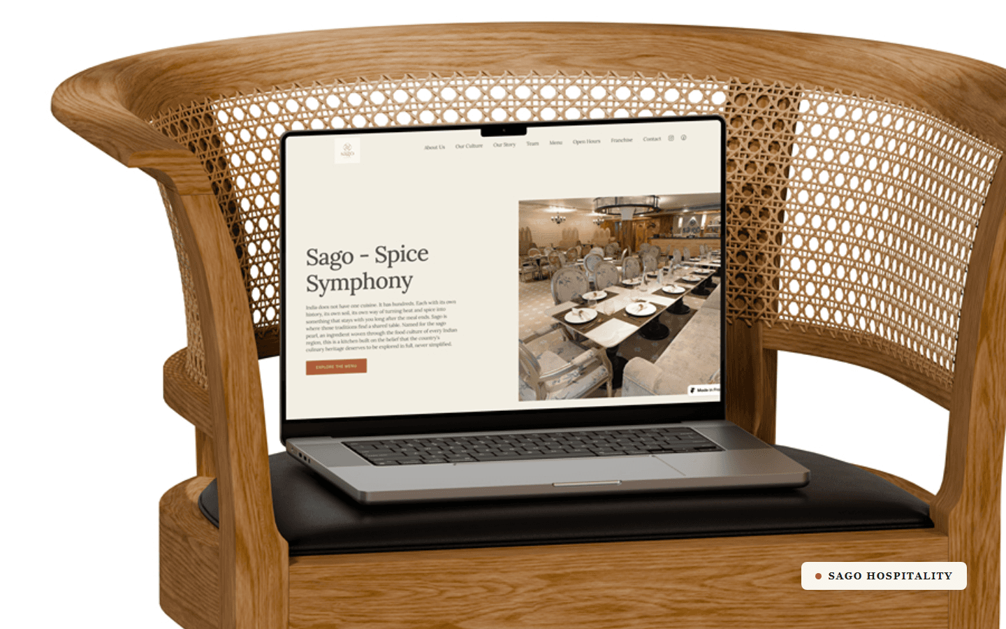
Keer. 925 silver. A first-time founder. A premium store, built from the SKU up.
Client
Keer
Year
2026
Scope of Work
Keer is a premium direct-to-consumer jewellery brand working in 925 sterling silver with 18K gold plating, built under Essenza Fine Jewellery. The founder was building his first ecommerce brand: he had the products and the vision, almost none of the technical machinery a modern D2C store runs on. The job was to build that machinery and teach him to run it.
The brief
No store, no catalogue structure, no sales infrastructure. Keer needed a Shopify build that could sit next to the labels it wanted to be shelved beside, and a back office that could carry it across marketplaces later. Every layer had to be built and explained at once, because he would be running it alone after handover.
Built on Shopify's Hyper theme by FoxEcom and then customised down to the component: a disciplined PT Serif and Lora design system, a David Yurman-referenced photography setup, a Mejuri-style size-guide sidebar, a custom product page, and an SKU system engineered to fit a physical barcode tag. The commerce stack (GoKwik, Shiprocket, Unicommerce, WhatsApp API) and the full measurement and SEO foundation were wired before launch. The detail is in the screens below.
One thing I'd do differently: lock the physical constraints before the digital ones. The SKU system was designed for the data first and then shortened to fit the tag's character limit, and the size guide shipped rings-only before splitting into per-category tabs. Both were clean fixes, but both would have been avoided by pinning the tag dimensions and the full size matrix on day one.
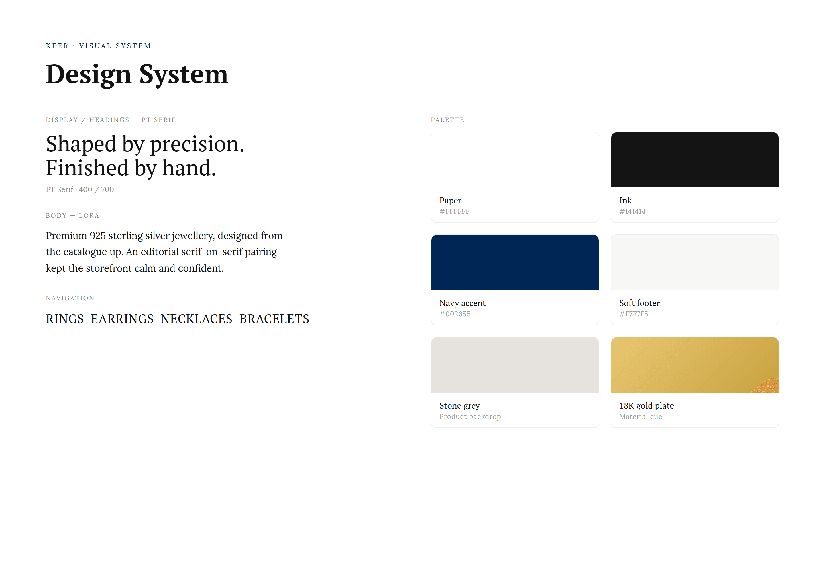
A first-time founder, a blank canvas, and a system to keep it premium.
Keer had products and a vision but no visual language. The system set the rules before a single page was built: PT Serif for display and headings, Lora for body, an editorial serif-on-serif pairing that reads calm and considered rather than loud. The palette is disciplined, a white paper ground, near-black ink, a single deep navy accent, a soft footer grey, and a stone-grey backdrop reserved for product photography. 18K gold plate sits in the system as a material cue, not a colour to decorate with. Every screen that follows inherits these tokens, so the storefront holds together at a premium without anyone policing it page by page.

Four categories, photographed as a system, not a menu.
The homepage routes the catalogue through four doors: Rings, Earrings, Necklaces, Bracelets. Each card is a single hero piece shot on the brand's stone-grey backdrop, so the navigation itself carries the photography standard rather than relying on icons or text links. A customer who knows what they want is one tap from the right shelf, and the section doubles as a statement of taste before any product page loads.

Curation that changes without a redevelopment.
The featured collections module runs on tabs, Ear Story, Layer It, The Stack Edit, The Minimalist Set, each swapping its product set and editorial image in place. It was built so the founder could re-merchandise the homepage himself, renaming and repopulating the edits from the Shopify admin without touching code. The result is a storefront that can follow a drop or a season without a developer in the loop.

Every card states the material before the price.
Fine jewellery lives or dies on trust in the metal. The product card was built to attribute it on sight: a Pure 925 Silver badge paired with the plating, Rhodium or 18K Gold, a cut label where it applies, and a wishlist control, all on the stone-grey ground. The badges are driven from product data, so the whole catalogue speaks the same language without per-product styling.

The brand argument, made on the homepage, not buried in an About page.
An editorial block carries the positioning where customers actually are. A dark, considered lifestyle image sits beside the brand seal and a single claim, Designed to Last, Worn Every Day, with the substance underneath: pure 925 sterling silver, hypoallergenic, precision plated, shaped through electroforming. It reads like a magazine spread rather than a feature list, and it sets the standard the product pages then have to live up to.

A product page that earns the price before the add to cart.
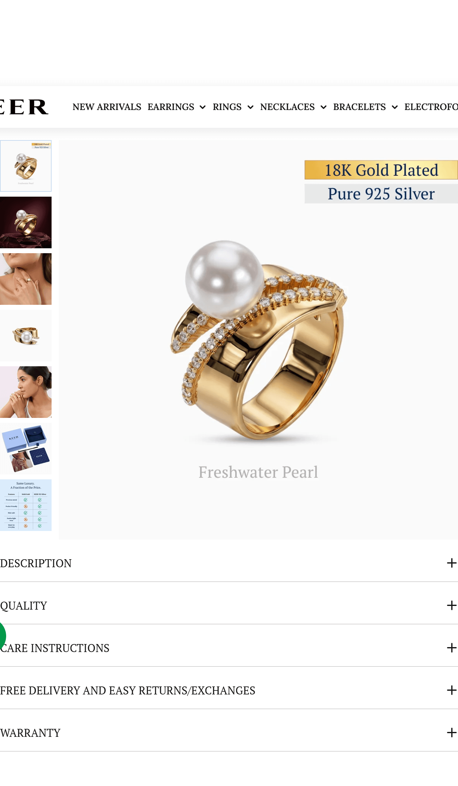
The product page was rebuilt around the buy decision. Stacked offer cards present the first-order and bulk discounts with copy-to-clipboard codes, the variant and quantity controls sit beside GoKwik's one-tap Buy Now, and a trust row, skin safe, anti-tarnish, free delivery, easy returns, runs under the fold. Collapsible Description, Quality, Care and Warranty tabs keep the detail accessible without lengthening the page. Wishlist, frequently-bought-together and the size guide are all one tap from the title.
Photography that takes its cue from David Yurman.
The reference was explicit. To make silver and gold read as refined rather than flat, the site runs a pure white background with product imagery on a soft stone-grey backdrop, the treatment David Yurman uses to keep metal looking expensive. Font and image loading were handled so the gallery, white-background packshots plus model-worn shots, stays crisp at retina without bloating the page. The backdrop is a fixed token in the system, so every new product photographed to it drops straight in.

A size guide built like Mejuri's, then taken further.
Off-the-shelf size charts open a clumsy modal. This one was custom-coded as a slide-in sidebar modelled on Mejuri: a custom element that mounts itself to the document body to escape the theme's z-index stacking, renders as a right-hand drawer on desktop and a bottom sheet on mobile, and inherits the theme's design tokens so it never needs reskinning. It started as rings-only and was extended into Rings, Chains and Bracelet tabs once the catalogue spanned more than one size system, with measuring instructions and an MM to US to India conversion table on each.

Made with intention. Shown step by step.
Most jewellery product pages assert craft. This one demonstrates it. A custom auto-advancing carousel walks through the making, Precision Moulding, Silver Casting, Stone Setting, each with a real process photograph and a line of copy, closing on the idea that the effort in every step is what makes the piece last. It was built to slide on its own, surface part of the next frame as a scroll cue, and sit between the gallery and the trust content where a considering buyer reaches it.

Answers written for customers and for search engines.
The FAQ does double duty. For shoppers it settles the real objections, is it genuine 925, will it tarnish, is it safe for sensitive skin, how do I size it, what about returns and warranty. For discovery it is structured so the questions and answers are eligible for rich results and answer engines, part of the SEO foundation set up across the store from day one. Each answer is specific enough to rank, the 925 authenticity reply leads with the hallmark stamp, not a platitude.

A collection page that filters fast and sells while it browses.
The collection page pairs a clean filter and sort bar with the same material-attributed product cards, so a customer can cut 42 rings down to the ones in their metal and budget without losing the brand's calm. An in-grid offer card surfaces the first-order and prepaid discounts inline rather than as a banner. The grid was tuned so plated and stone variants read clearly at a glance, and sold-through states never masquerade as available.

Upsell that slides, without slowing the page.
The You May Also Like rail was built as a slider so it can show six to eight related pieces instead of a fixed three, each card carrying the same badges, wishlist and best-seller treatment as the rest of the store. It keeps the cross-sell dense where it earns attention, at the bottom of the product page and in the cart, without stacking more height onto an already long product page.