Dayal Opticals. Three generations. 18 boutiques. An online store redesigned to match the brand behind it.
Client
Dayal Opticals
Year
2024
Scope of Work
Dayal Opticals is one of India's most established optical retail chains. Founded three generations ago, the brand operates 18 boutiques across Delhi, Mumbai, Gurugram, Chandigarh, and Mohali, carrying eyewear from PRADA, VERSACE, BURBERRY, MYKITA, miu miu, MONTBLANC, MARC JACOBS, MONCLER, and two dozen more premium labels. Frames start at ₹11,990 for Ray-Ban and reach ₹85,900 for AKONI. The stores had a loyal, high-income clientele. The website did not reflect the brand they were walking into.
The brief
The online store needed to do what the physical boutiques had spent three generations doing: signal that this was the right place to buy PRADA, not just a place that sells it. Collection pages were loading unreliably. Reviews were sparse. The 18-boutique network had no dedicated page anywhere on the site. And 1,655 products were sitting in a grid with no brand attribution on any card.
Vision was chosen for its built-in quick-view and collection filter scaffolding, which allowed custom Liquid work to focus on brand attribution, specification display, and review integration rather than rebuilding core catalog infrastructure from scratch. I led the Shopify strategy and Liquid customization, and managed a junior development team on catalog operations across the full SKU range.
The redesigned store launched with deep Vision theme customization, JudgeMe reviews with verified purchase badges and customer photo uploads integrated across all product pages, and a custom boutiques page built on PageFly with illustrated city maps and per-location directions. The site now generates 25 to 30 lakh rupees (~$30,000 USD) in monthly sales across five cities.
One thing I would do differently: instrument per-brand conversion tracking from day one rather than retrofitting it after launch. Knowing which labels drive the most add-to-carts would have shaped the above-fold hierarchy from the start.
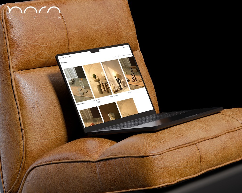
A walkthrough of the full store: the mega navigation, Collector's Edition, product pages, cart drawer, and the boutiques directory.


Generic fashion hero. The redesign opens with the actual brand.
The old site opened with a full-bleed editorial image and a SHOP NOW button. No mention of 18 boutiques, no premium brand names in the hero, no signal of the 60-year retail history behind the store. It was indistinguishable from any mid-tier fashion Shopify store. The redesign opens with an editorial campaign hero for a named collection, followed by a curated "DO's Featured Picks" shelf with tabbed Best Sellers and New Arrivals. PRADA at ₹34,390 and VERSACE at ₹24,191 appear within the first scroll. The brand's price positioning is established before the customer reaches a category page.


1,655 products with no brand context. Each card now carries it.
1,655 products, each with a product image, model number, and price. No brand name, no color count, no sale indicator. On a catalog where a BURBERRY frame and a Ray-Ban sit four products apart in the same grid, that omission matters. The new collection architecture places the brand name above every product title: BURBERRY, PRADA, ALEXANDER MCQUEEN, VERSACE, each with a color count and a discount badge where applicable. The filter and sort system was rebuilt in Liquid to handle catalog depth without degrading page load. Collection pages that previously failed to render products reliably now load 421 filtered SKUs consistently.


Brand attribution above the fold. The trust signal that was missing.
Color swatches, a size selector, and a specification table: MODEL NO, MATERIAL, GENDER, SHAPE, TYPE. Functional, but no brand context above the fold and no review signal before the add-to-cart button. The new product page places brand attribution, PRADA, as its own line above the model name, then the price, then a 5-star verified rating before the purchase flow begins. For PRADA 0PR 17WS at ₹38,490, a customer making that decision online needs confirmation they are buying a genuine PRADA frame from a verified retailer before they scroll. That rating line, visible at entry, does more trust work than any copy on the page.


18 boutiques. Five cities. Built to be found, not just listed.
Store addresses were in the footer. No dedicated page, no map, no separation between cities. The new boutiques page opens with an illustrated geographic map of the DO store network across Delhi, Mumbai, Gurugram, Chandigarh, and Mohali, with each city's locations plotted by name. Below the map, a city tab system loads the full details for each location: address, direct phone number, operating hours Monday through Sunday, and a GET DIRECTIONS button that resolves to Google Maps. For a brand whose physical stores are the primary point of sale, this page functions as a direct acquisition tool for customers who research online and convert in person.


A store built around the brand, not the other way around.
The old homepage opened with a generic full-bleed image and a SHOP NOW button. No brand names above the fold. No price anchoring. No signal of 60 years of retail history.
The homepage leads with the current hero collection and surfaces 60+ brands without overwhelming the customer. The catalog covers 2,917 sunglasses alone, ranging from Rs9,000 Oakleys to Rs30,000+ Pradas. The store had to feel like the brands it carries. It does.

The Collector's Edition is its own world.
There was no Collector's Edition page on the old site. 517 pieces from VAVA, SATO, and Anna-Karin Karlsson sat inside the general catalog with no separation, no editorial identity, nothing to signal these weren't standard inventory.
517 pieces. Brands like VAVA, Gast, SATO, Anna-Karin Karlsson, Akoni, and For Art's Sake. Handpicked from independent houses around the world. This section needed its own visual language. Dark background, editorial layout, brand-first browsing. A customer who finds this section is not comparison shopping. They are discovering.


You don't start with colors when you have 111 collections.
You start with a sitemap. Every collection, every policy page, every blog post, every account flow. The full site architecture was mapped in Whimsical before the first line of Liquid. The mega navigation alone had to handle 60 plus brands across sunglasses, optical frames, contact lenses, and a Collector's Edition. Get that wrong and customers bounce before they ever browse. The brand pages, the category hierarchy, the breadcrumb logic. All of it decided on paper first.

Research before Liquid.
Before writing a line of Liquid, I built a research brief on the brand.
Brand documents, product catalogues, and customer review patterns were synthesised into an audio briefing using NotebookLM. Three buyer profiles emerged: gift buyers who need reassurance on quality, eyewear collectors who already know the brand name they want, and walk in regulars moving online for the first time.
That research shaped every information architecture decision. Collections are ordered by brand recognition, not alphabetically. The mega nav leads with the most searched collections first. Search is surfaced prominently on mobile because collectors arrive knowing exactly what they are looking for. The breadcrumb was customised in Liquid to show the specific brand and model name rather than a generic category path.
Performance.
Tested on the live store post-launch. Cold load, no cache, mobile and desktop. Custom Liquid overrides, third-party app overhead, and full product catalog included.