Qurist. Doctor-led medical cannabis. One Shopify store, run month to month, measured before anything ships.
Client
Qurist
Year
2026–Present
Scope of Work
Qurist sells doctor-led medical cannabis in India: CBD and CBD+THC oils, gummies and pills, licensed by the Ministry of AYUSH and prescribed after a free consultation. The store had been built by an agency and edited by many hands since. Headings sized section by section, a footer in ten type sizes, 36 apps installed, the same conversion events firing two and three times. The team wanted one person to own it.
The brief
Since June 2026 the store runs on a monthly retainer. First the homepage: one typeface, one 1600 px grid, one 20 px rhythm, concern colours sampled from the product packaging, and 55 changes shipped in a single push on 17 June. Then the pages behind it: a product-page system on shared tokens, five city SEO pages, a consultation page with the real medical team on it, and an About Us built from the founder's brief. Every change is scripted through the Admin API, staged, measured at render, and logged.
The audits paid for themselves. Nine unused apps came off the bill. A Typeform embed that took 12.4 seconds to appear became a Tally form at 3.8. A pile of 5,470 live discount codes became a reviewable list of 3,424 to retire. The detail is in the screens below.
One thing I'd do differently: read the live theme before every push, from day one. Staging and live drift when a client edits their own store, and the rule that fixed it arrived in September instead of June.

The homepage that shipped as one push, on 17 June 2026.
Fifty-five changes across the page, footer, search and product data, built and verified on a parallel theme and published whole once the founders signed off. The system underneath: one typeface, a 1600 px container with 48 px gutters, a flat 20 px rhythm between sections, and a colour rule of white pages, one warm accent, and teal only for prices and key buttons.

Shop By Concern, with the colours sampled from the boxes.
The first section after the hero lets a shopper pick Pain, Anxiety, Sleep or Pets and see the products for it. The concern colours were not picked from a palette. A script sampled them off the product packaging, so the site and the box on the desk speak the same colour. Cards carry the rating with its review count, a bolder current price and a readable Save badge, applied store-wide.

A comparison that proves the difference instead of describing it.
The original section was a before-and-after slider that read as a third photo between two banners. It became a proof module: the brand's extract beside a generic one, three claims the brand can stand behind, and a single button. Built as its own section with editable rows, so the team can add a claim without touching code.

Trending Now is a full product page, folded into the homepage.
The CBD Oil block lets a shopper pick a strength, set a quantity and see the volume tiers without leaving the homepage. Product name bold, price in brand teal on its own line, the duplicate price removed, the rating on its own line. Choose Your Strength was set to Title Case across the whole catalogue through the Admin API rather than product by product.
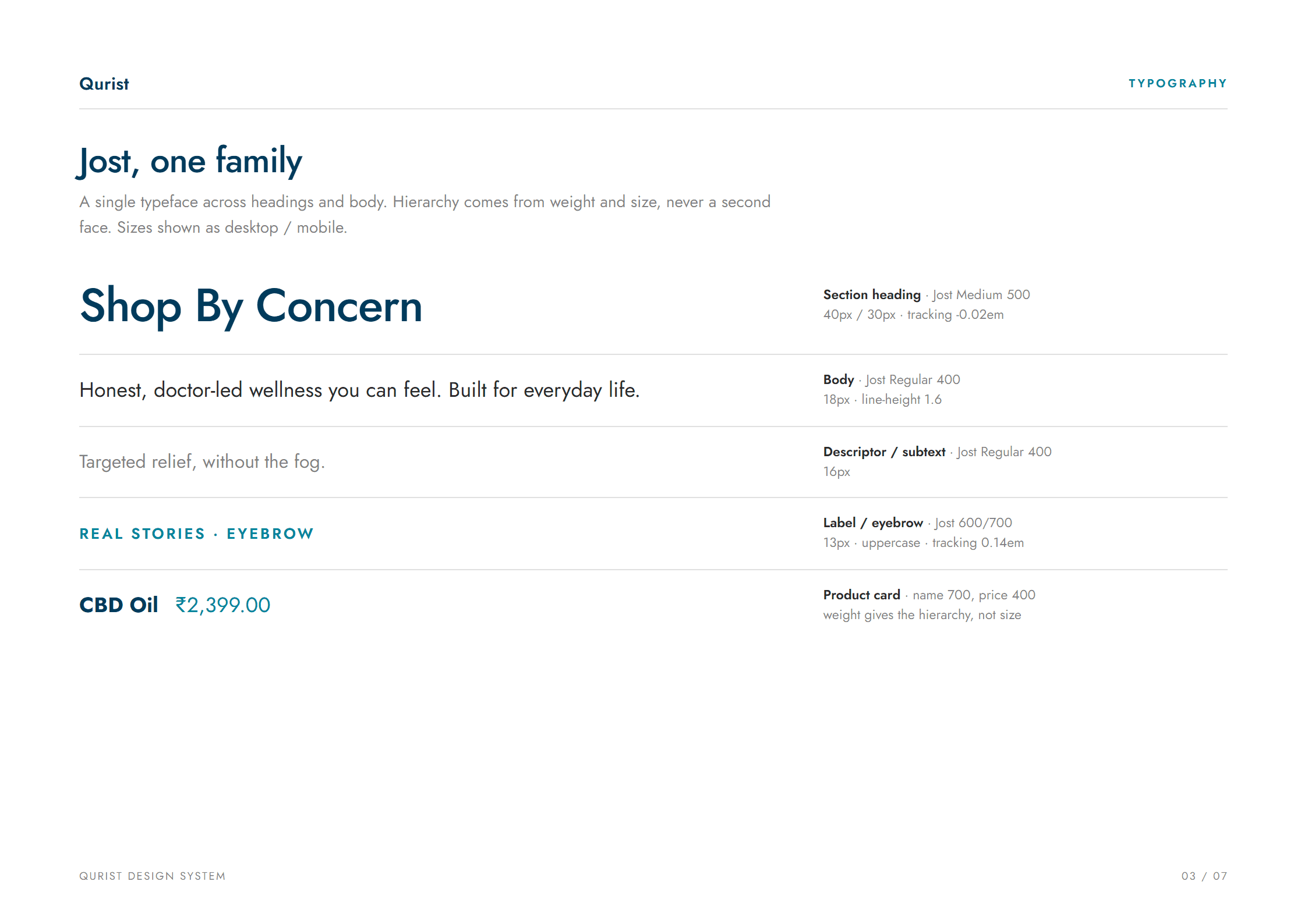
One typeface. Hierarchy from weight and size, never a second face.
Jost across headings and body. Section headings 40 px on desktop and 30 on mobile at weight 500, body 18 px at line-height 1.6, labels 13 px uppercase with 0.14 em tracking. The deck went to the client team on 9 June 2026, so every later page, from product pages to city landing pages, had a spec to be checked against.

Black and white base, colour as accent, four concerns with their own hue.
Teal for buttons and prices, navy for the footer anchor, ink for text, and section tints used at full value rather than washed out. The concern system came from the client's own design team; the deck records the accent and wash for each so nobody guesses a hex again. Where a supplied colour failed the 4.5:1 contrast floor, it went back to design before it shipped.

The consultation page put the real doctors on it.
Four matched portraits replaced a generated stock image, each card carrying the name, role, years of practice and hospital history, with the full profile behind a dialog that becomes a bottom sheet on phones. The Typeform embed that took 12.4 seconds to appear on a cold load became a Tally form at 3.8 seconds, with every lead writing into the client's own Google Sheet, timestamped in IST.

An About page built from the founder's brief, checked at sixteen widths.
Seven sections, all editable: pillars, a timeline, the founder's letter, the process, proof, and the community work. Every image is served at the size its slot needs, which made the page about a quarter lighter on tablets than the first build. It was checked at sixteen screen widths from 320 to 1920 and with JavaScript off before it went live on 26 August 2026.

Five city pages, one master template, built to the SEO team's spec.
Bangalore was built first as the master: a single H1, a benefits band, top reviews, city-specific FAQs with internal links, and the product block. Chennai, Mumbai, Kerala and Delhi were cloned from it with their own content docs. Delhi had been returning a 404 while ranking second for its keyword; it was published and rebuilt to the full spec the same day the content arrived.

Product pages on one token file, so a fix lands everywhere.
Twelve product pages were audited at render and unified behind one set of tokens: a single 1180 px measure against eight different content edges, one heading spec against three line-heights, and one beige against four near-neutral surfaces. A global padding rule leaking out of two accordion snippets had been re-spacing every other section on ten templates. Removed, and the whole site runs one 20 px rhythm.
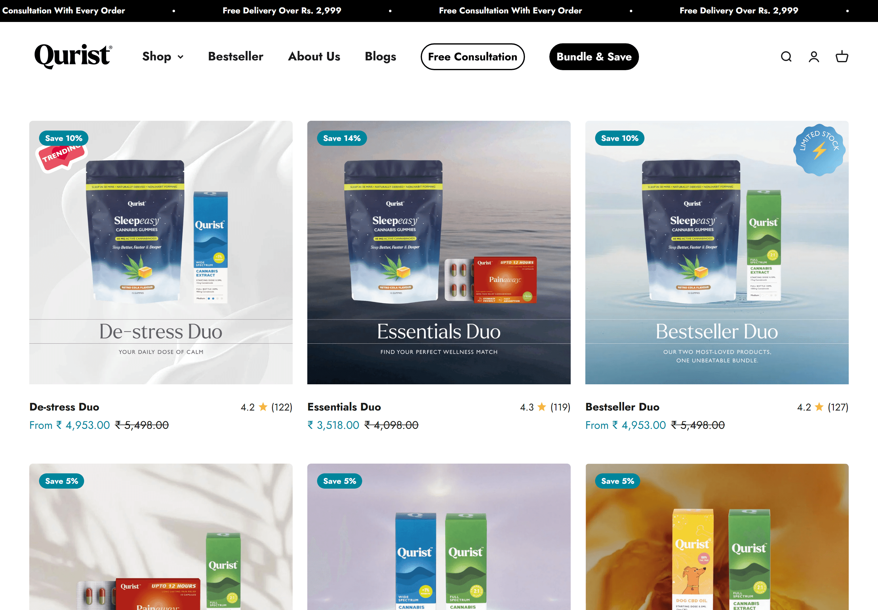
Bundle pricing is monthly work now, and it is scripted.
Six bundles, 28 variants, repriced from one sheet. Each change is checked four ways: admin readback, the storefront JSON, the rendered page, and a real 28-line cart to confirm what a customer is charged, because the displayed price and the charged price can split. The August sale was reverted the same way, and the script runs again each month.

The store had 5,470 live discount codes. The brief said a few hundred.
Pulled read-only from the Admin API in August 2026. Filtering to unused codes with no expiry removed only six percent, so the useful cut was age: 3,424 codes created in 2024 or earlier, never redeemed, with no end date, handed over as a CSV with the admin ID on every row. The two other piles, app-generated recovery codes and recent one-offs, were named and deliberately left alone.
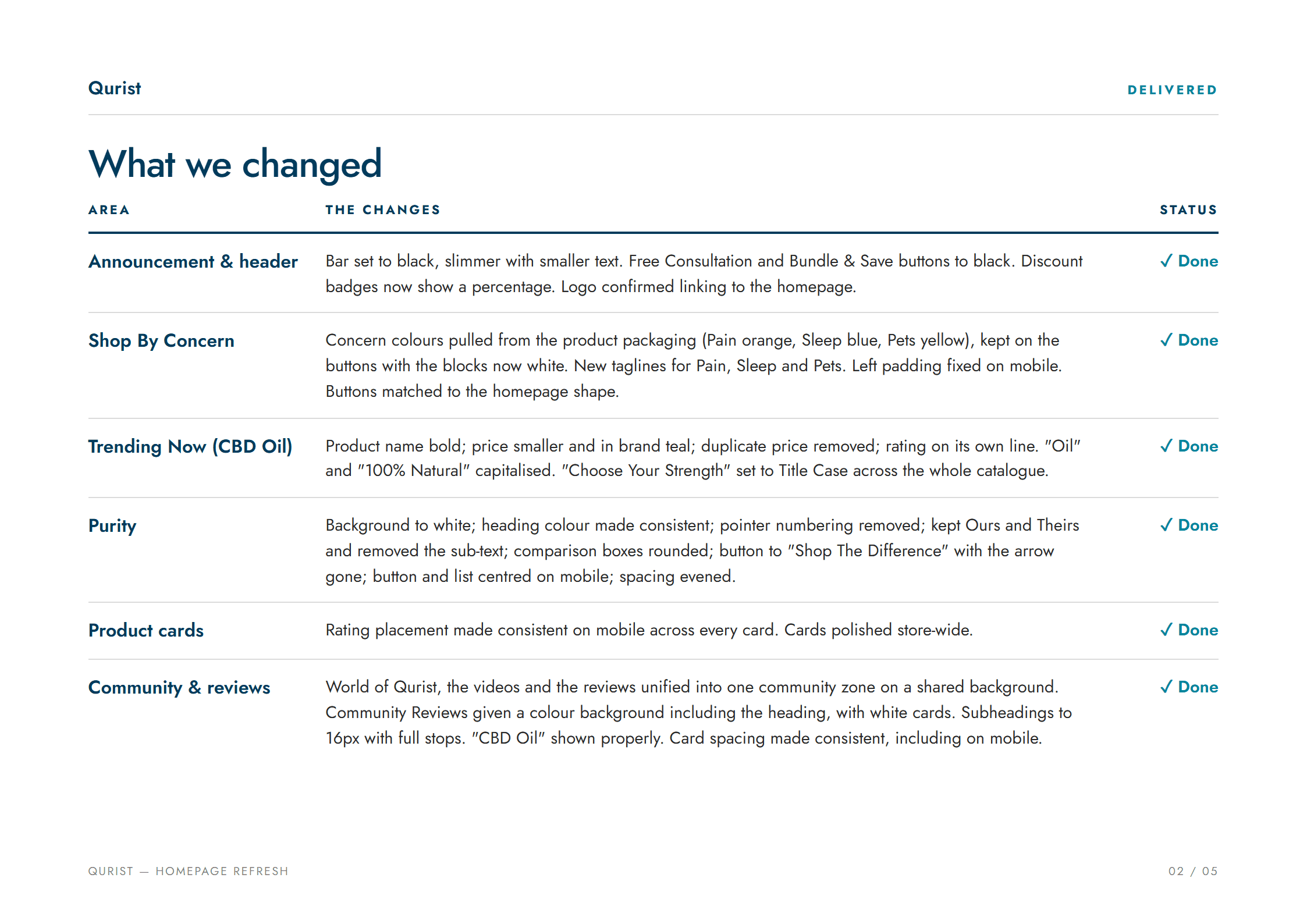
Every round of work ends with a report the client can forward.
The homepage refresh report: five pages, table-driven, on brand. What changed by area, the technical pieces explained in plain language, and what waits on whose input. The same format carries the monthly work tracker, the app audit and the discount audit, so the client always reads the work in one shape.